Sunday, February 24, 2019

Stata Hint: How to Address Potential Problem with Amazing Data..

The typical problem in research: We have a great idea, a great identification strategy...but we can't find a variable we'd need in any existing data set. 

Another "problem": We find an amazing data set with multiple measures of that variable. Or maybe the data is large and rich enough that we can cut the data in many, many different ways to do subgroup analysis. 

What's the problem with that? The problem is that if we run enough regressions, by chance, we should get at least one estimate of interest with a p-value of less than 0.05. This is nothing to be excited about. So how do we adjust our standard errors to take into account that we're running multiple regressions? 

One answer: Westfall-Young adjustments 

Great news: It's easy to implement in Stata, even with clustered standard errors. See this twitter thread explaining it. Or see here for a more detailed explanation. Or just type “ssc install wyoung, replace” into Stata and then read the help file. 

Thank you, Julian Reif and coauthors, for sharing this very useful resource with all of us! 

Friday, February 15, 2019

More on Writing Referee Reports

Alternative title for this post: How to write a paper by backwards induction!

I found this handy dandy template for writing a referee report. Thank you, Plamen Nikolov. Yes, have a look at it before sitting down to write a referee report. But I thought that it is even more useful as a checklist you should go through before sending your paper out to a journal. If you can't answer the questions in the template very quickly and relatively easy, your paper probably isn't yet ready to be sent to reviewers.

Also, (re-)read the Journal of Economics Perspectives piece on how to write an effective referee report. 

Stata Hint: How to Add Standard Errors to Bar Charts

Quick, name a difference between top researchers and mediocre researchers! Ok, lots of potential answers to this one, but here's my favorite: top researchers present pictures that very clearly show their main results. Mediocre/lazy researchers present tables that people can barely see much less understand. 

But how do you present a picture, let's say--a bar chart, while at the same time showing how confident we should be in any differences? David McKenzie and, more recently, Benjamin Daniels, have the answer for us: Add standard error bars


2019 Economic Demography Preliminary Program

The preliminary program for the 2019 Economic Demography Workshop (EDW) has been posted. Stay tuned for more details--especially about discussants. For over twenty years, a group of economists have gathered on the day before the annual Population Association of America (PAA) meeting to hear and discuss six or so papers in demographic economics. The papers and discussions are always excellent, and I expect this year to be no different!

Saturday, February 2, 2019

How About Those Effect Sizes?

We're all guilty. We run those regressions and just hope to see those little stars, those p values less than .05. Often students come to my office excited to show stars without even peaking at the coefficient estimates. Drafts of papers are written that say "and the estimate is significant" without even mentioning what the estimate is, never mind trying to figure out whether it is big or small or even reasonable. 

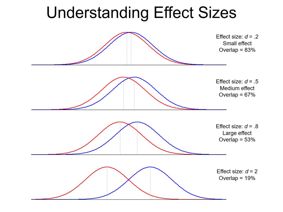
But what is the best way to interpret our estimated coefficients? How do we put those numbers in perspective, especially when our variable of interest is an index or test score or something else that readers may not have personal experience with? One possibility is to say something like, "the effect size is about half a standard deviation.." What does this actually mean? My old friend, Lionel Page, comes to the rescue with some handy dandy pictures. Even with effect sizes of 2 standard deviations, there is still quite a bit of overlap in the two distributions! By all means, compare means...but please, stay humble!